Artisan Butcher Shop
Sean Bacon & Bradford Prairie
Portfolio A
Branding
Crimson Text & Hand Lettering
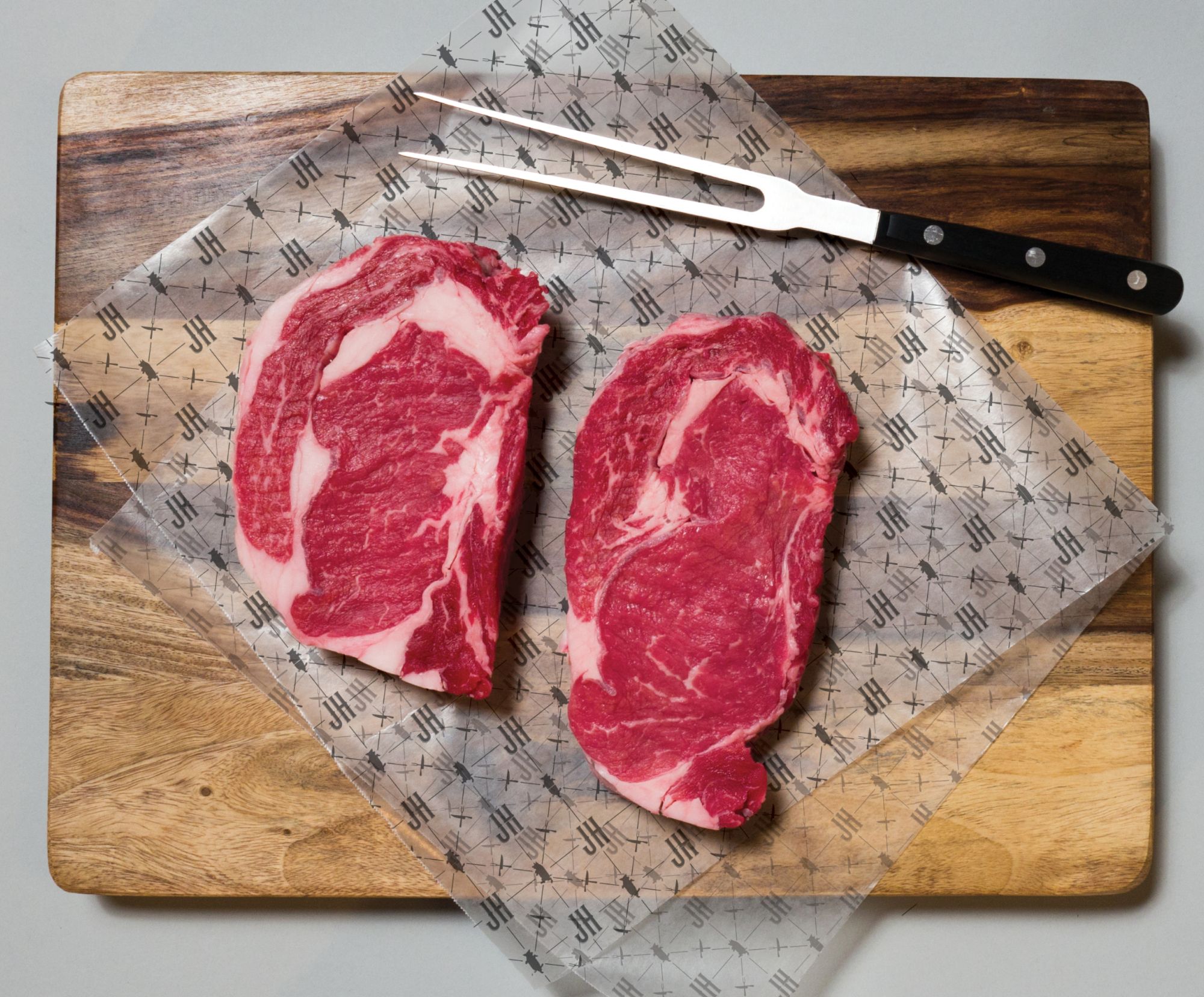
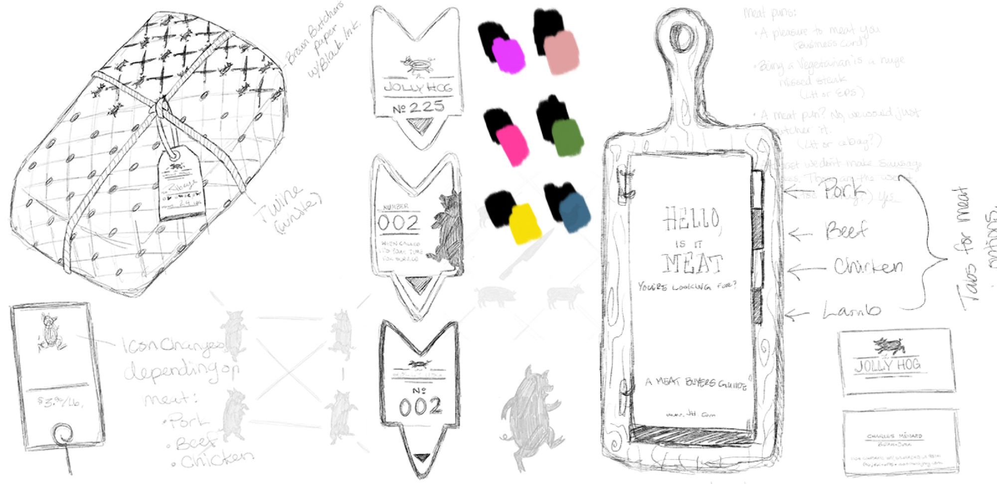
The Jolly Hog is an artisan butcher shop that utilizes the whole animal to help minimize food waste, filling the need for healthy alternatives to the meats that are being offered at large chain grocery stores. It is a sustainable and humane business for all meat lovers and aficionados, primarily targeting men ages 32–47.
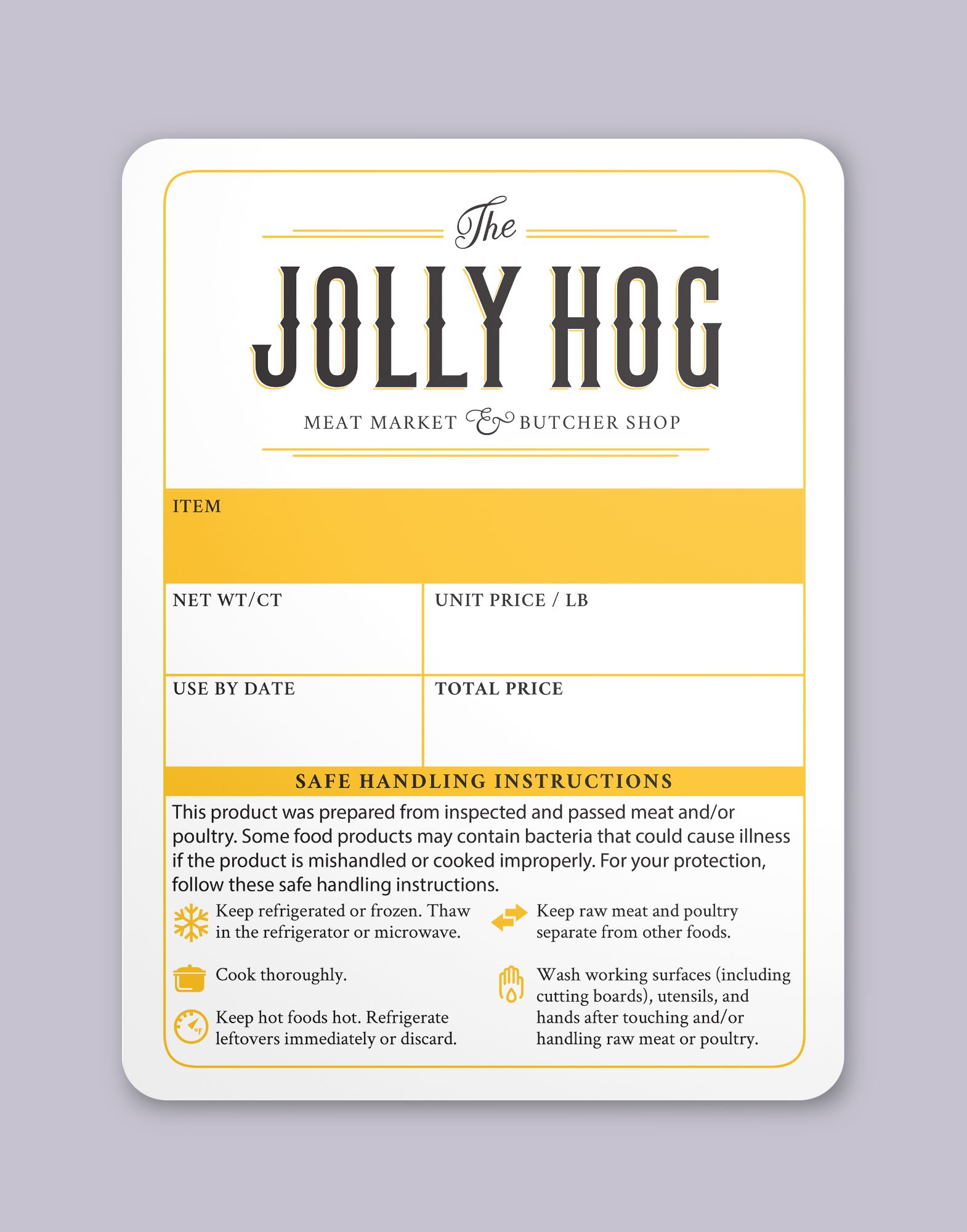
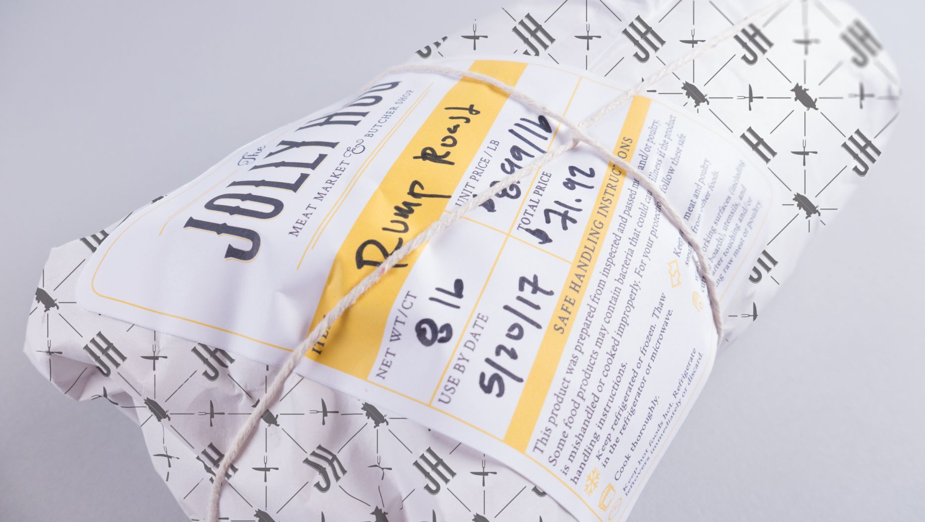
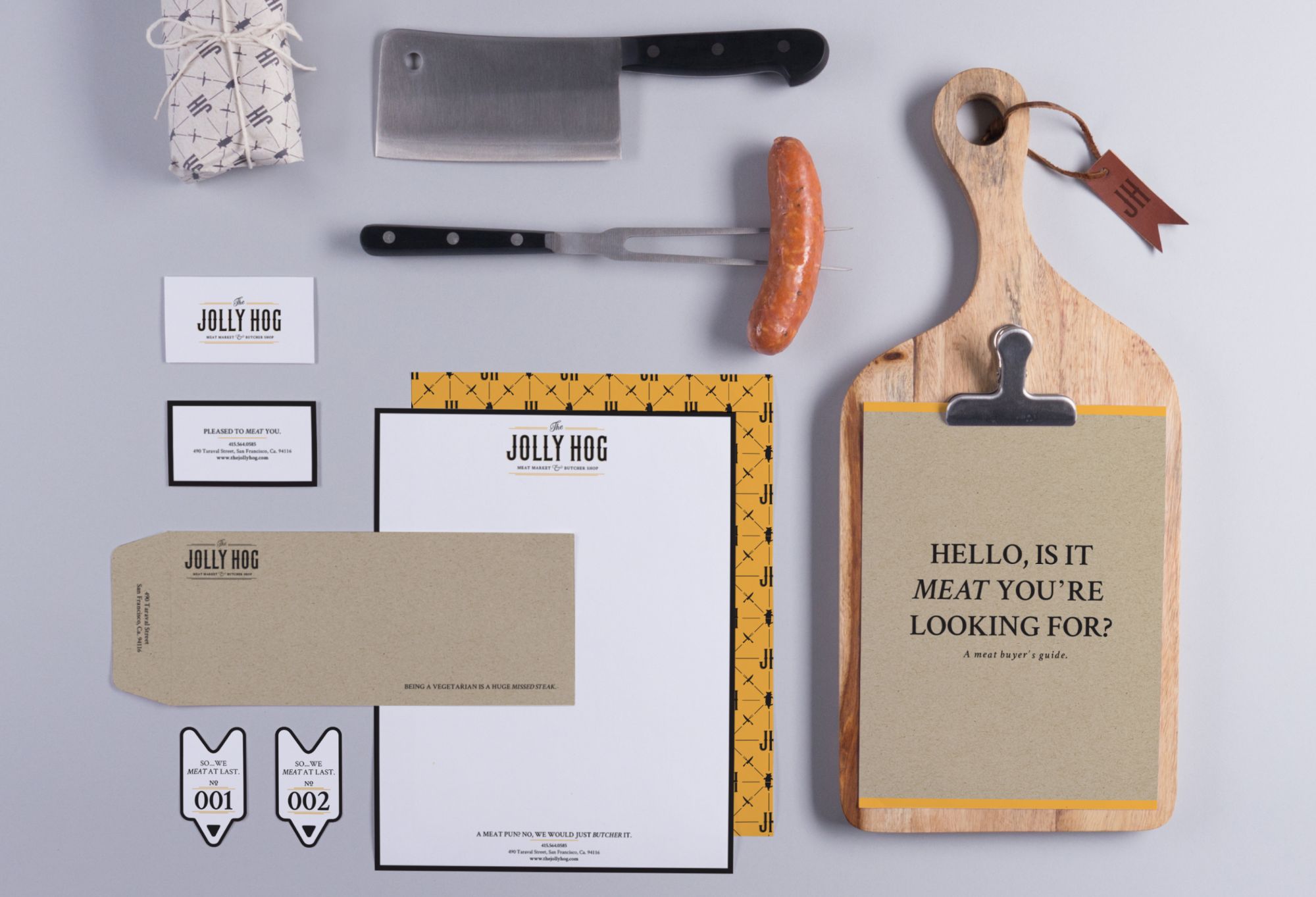
I wanted The Jolly Hog to be both fun and welcoming. This shop is unique, so I avoided the use of colors, like red, typically associated with butcher shops, and opted instead for a bright yellow, which helps to reinforce a positive look and feel. The brand is high end and cheeky with a brand voice that includes the use of meat related puns in a sophisticated serif.
design in mind
My initial sketch included a pig jumping over ‘The.’ I wanted to incorporate a visual action associated with being ‘jolly’ while keeping the typography in a tight lock-up. I envisioned a bold, western inspired typeface.
When going from a sketch to a vector graphic, I ran into spacing issues. Including the pig made the word ‘The’ too small and, when scaled down, the word was completely illegible. I started looking for other solutions.
I began exploring a more typographic direction, and incorporating the pig into other brand elements. This allowed for a cleaner, tighter lock-up of the logo and clearer legibility.
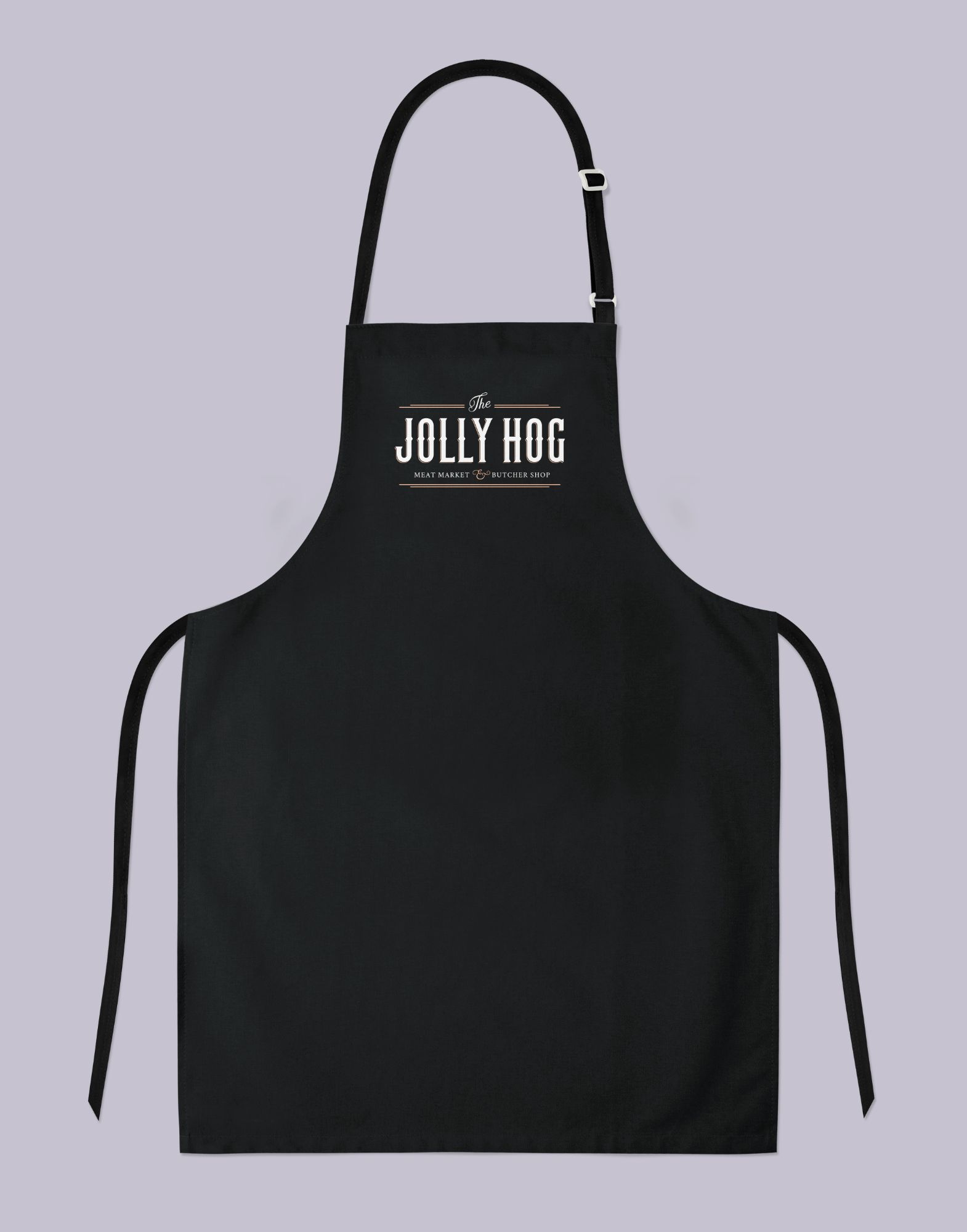
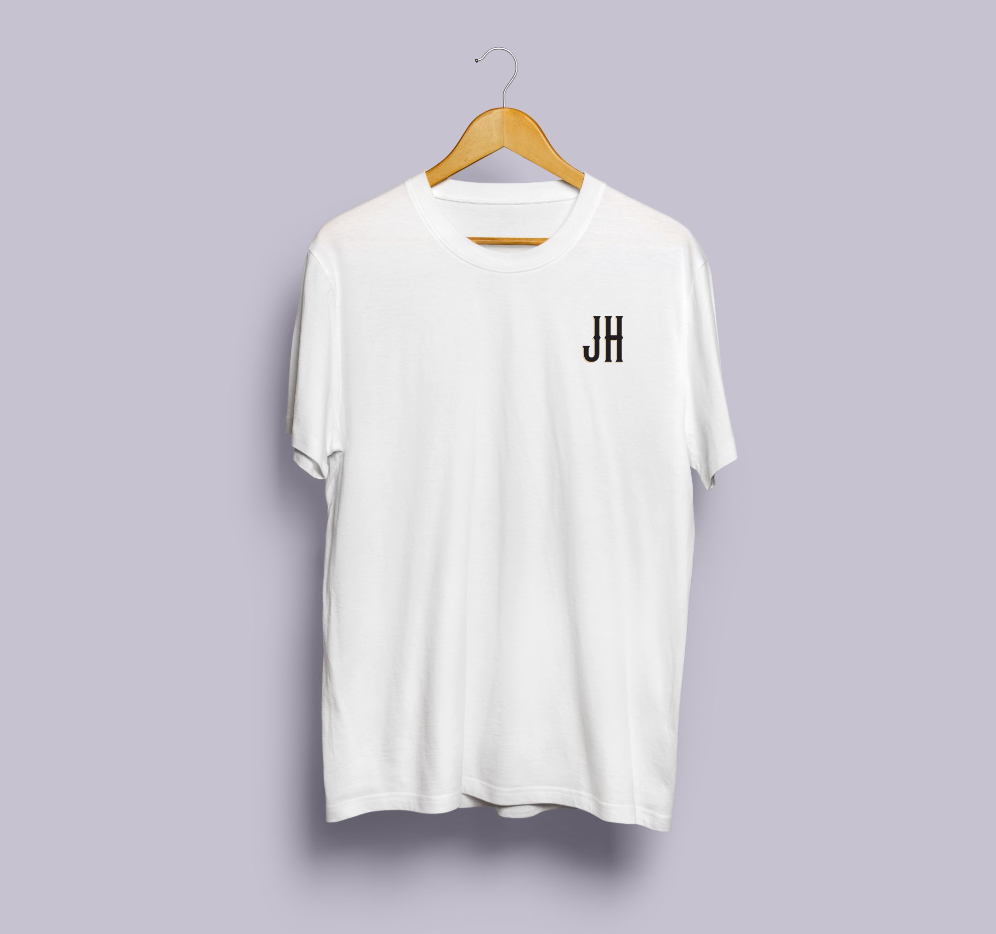
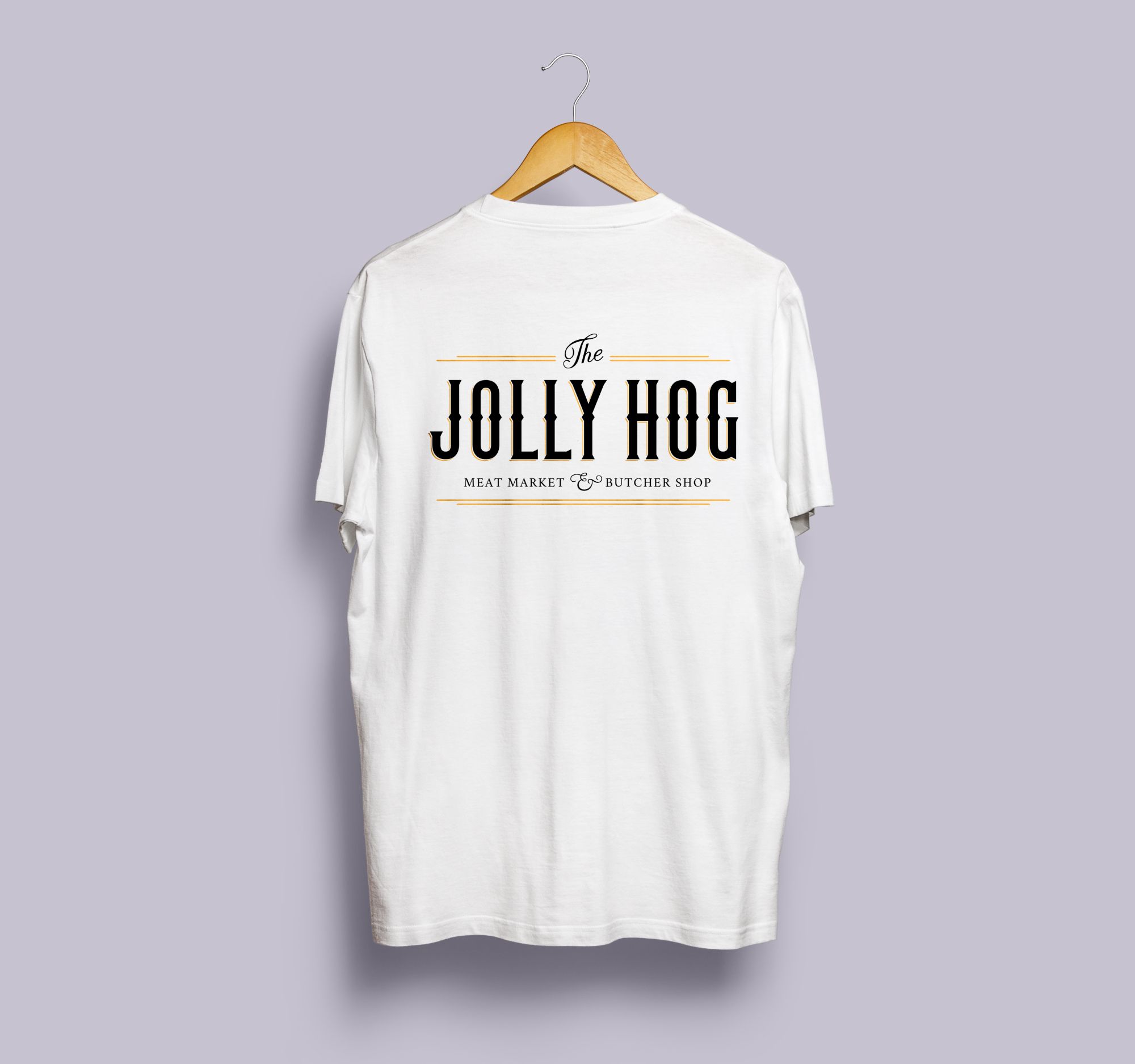
The final logo combines a clean, custom script serif with Crimson Text, selected for its high-contrast serifs to complement the script. The brand yellow appears as a thin offset highlight inspired by hand painted signage.
creating a


branded
branded