Summer Camp
Sean Bacon
Page Layout
Layout & Typography
Gothic Cond., Notera, & Custom Slab
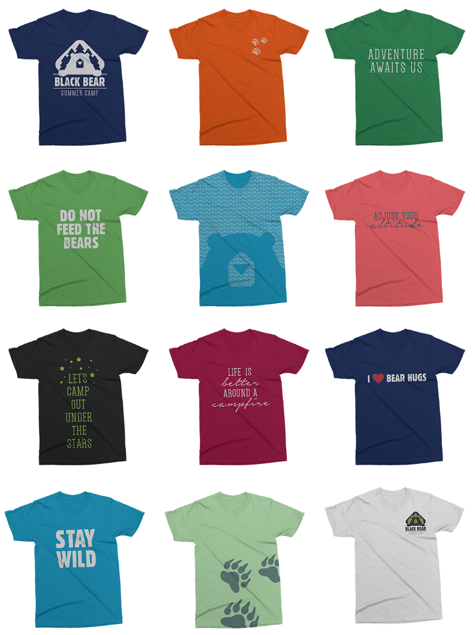
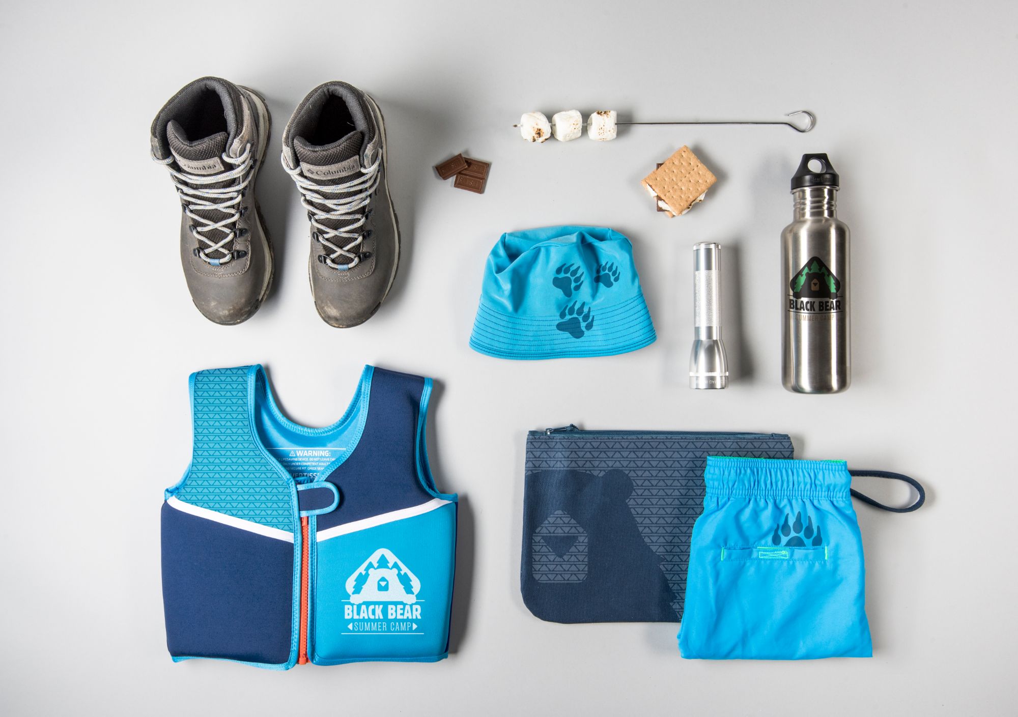
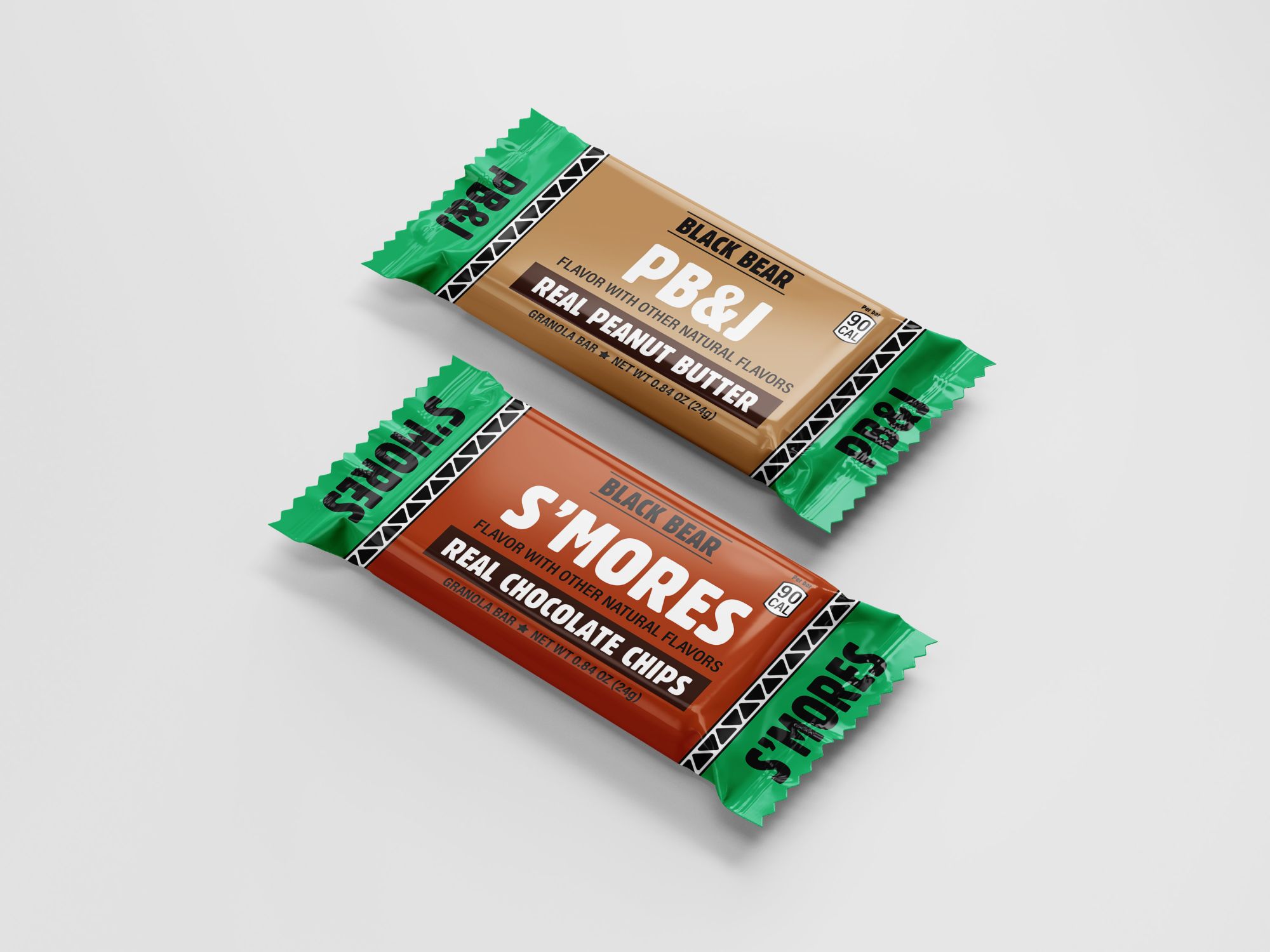
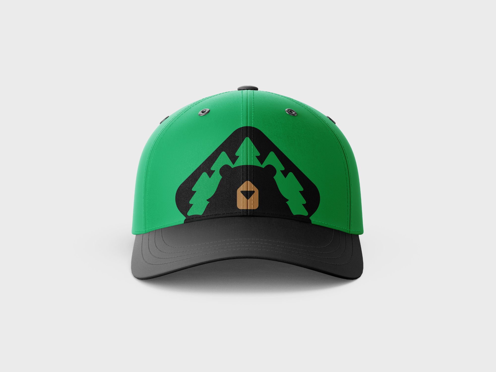
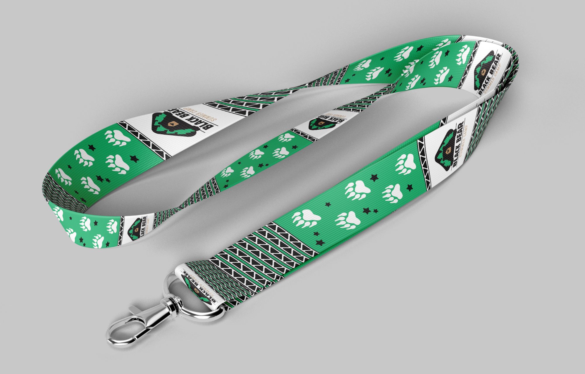
Black Bear is a co-ed summer camp that offers a wide range of outdoor activities for kids ages 5–17. They offer varying lengths of camp experiences, ranging from day long activities to six week adventures.
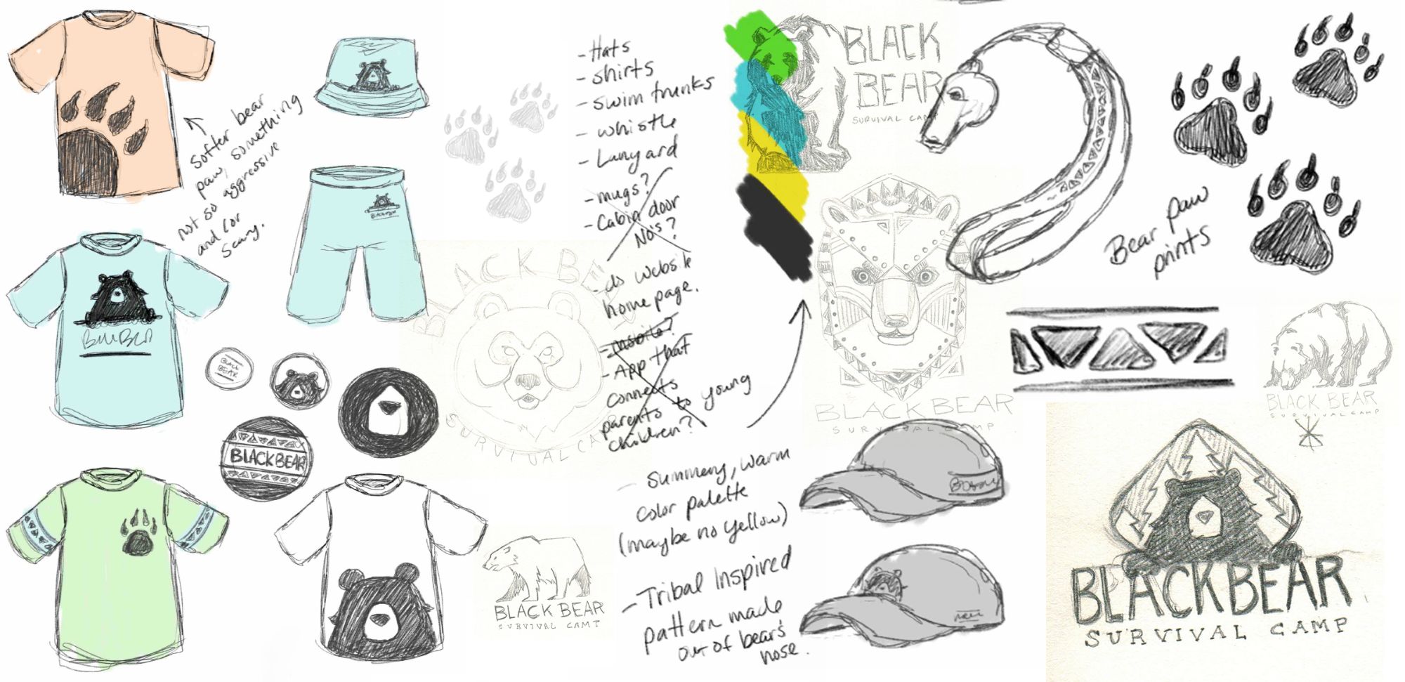
I wanted the design of Black Bear to be simple and bold. In order to illustrate a bear that is both prominent and strong without appearing scary for the youngest campers (and simultaneously not too childish for the older campers), I used a simplified illustration. Minimal features and rounded edges give the bear a friendlier appearance without being overly cute. The ‘Gothic’ typeface of ‘Black Bear’ features a similar thickness to the logo’s rustic, natural feel and is paired with a thinner, custom-made slab serif to offer a striking contrast.
design in mind


branded
branded