
Loose Leaf Chinese Tea
Min Choi
Logo & Packaging
Packaging
Canter & Josefin Sans
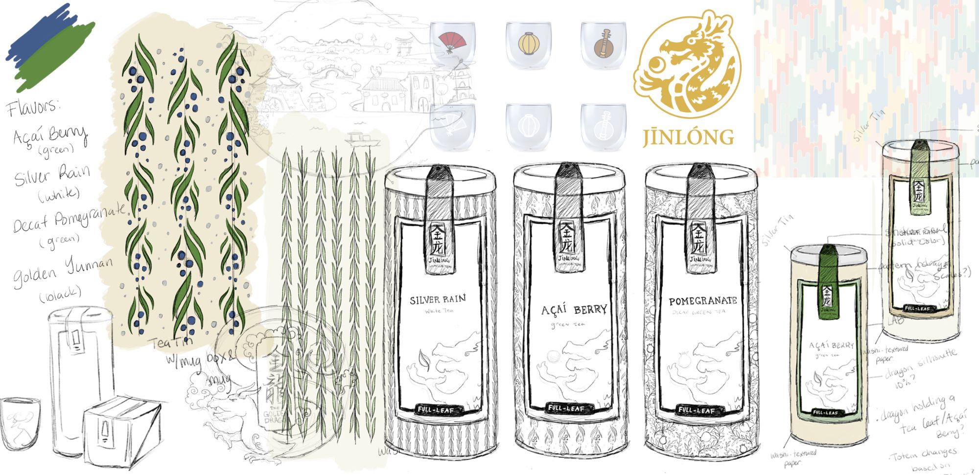
JīnLóng is a modern, luxury loose-leaf tea company with a traditional Chinese influence. The concept of tea culture is referred to as chayi, “the art of drinking tea.” JīnLóng targets wealthy tea aficionados, ages 35–50, who are interested in learning about global tea cultures. The name JīnLóng is inspired by deep-rooted Chinese beliefs. ‘Jin’ means gold or golden and is considered the
most beautiful color, while ‘Long’, meaning dragon is the symbol of power, strength, and good fortune.
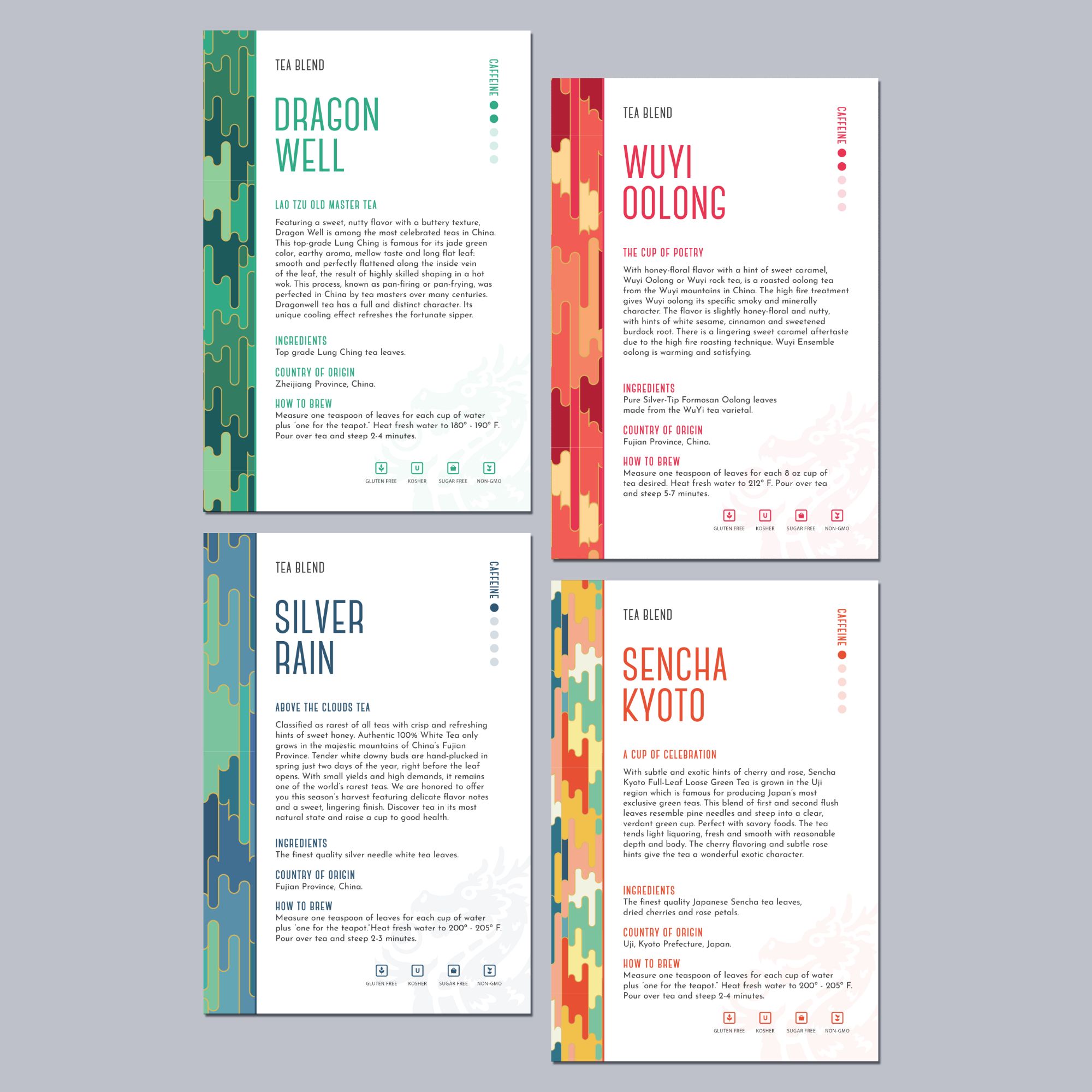
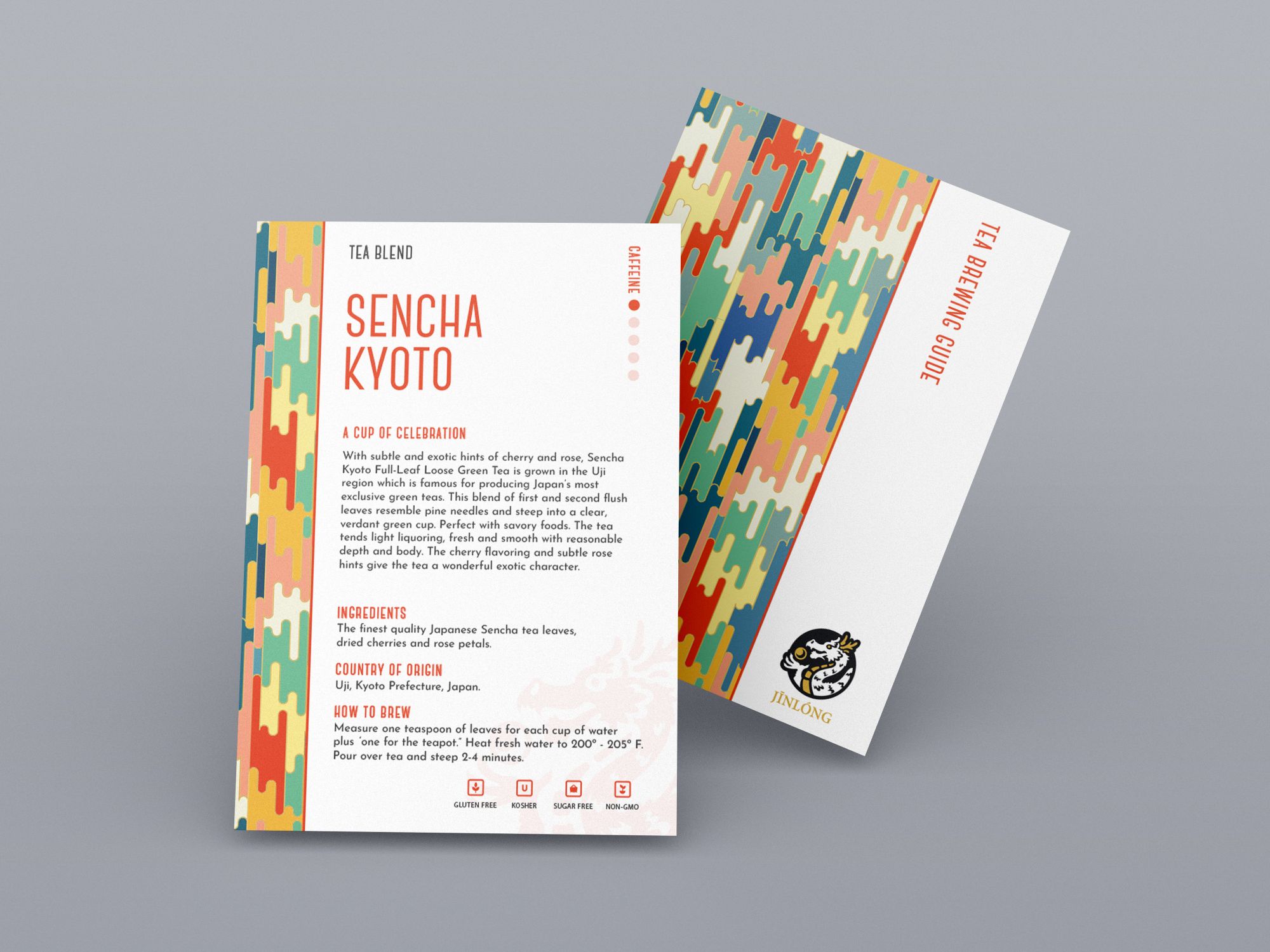
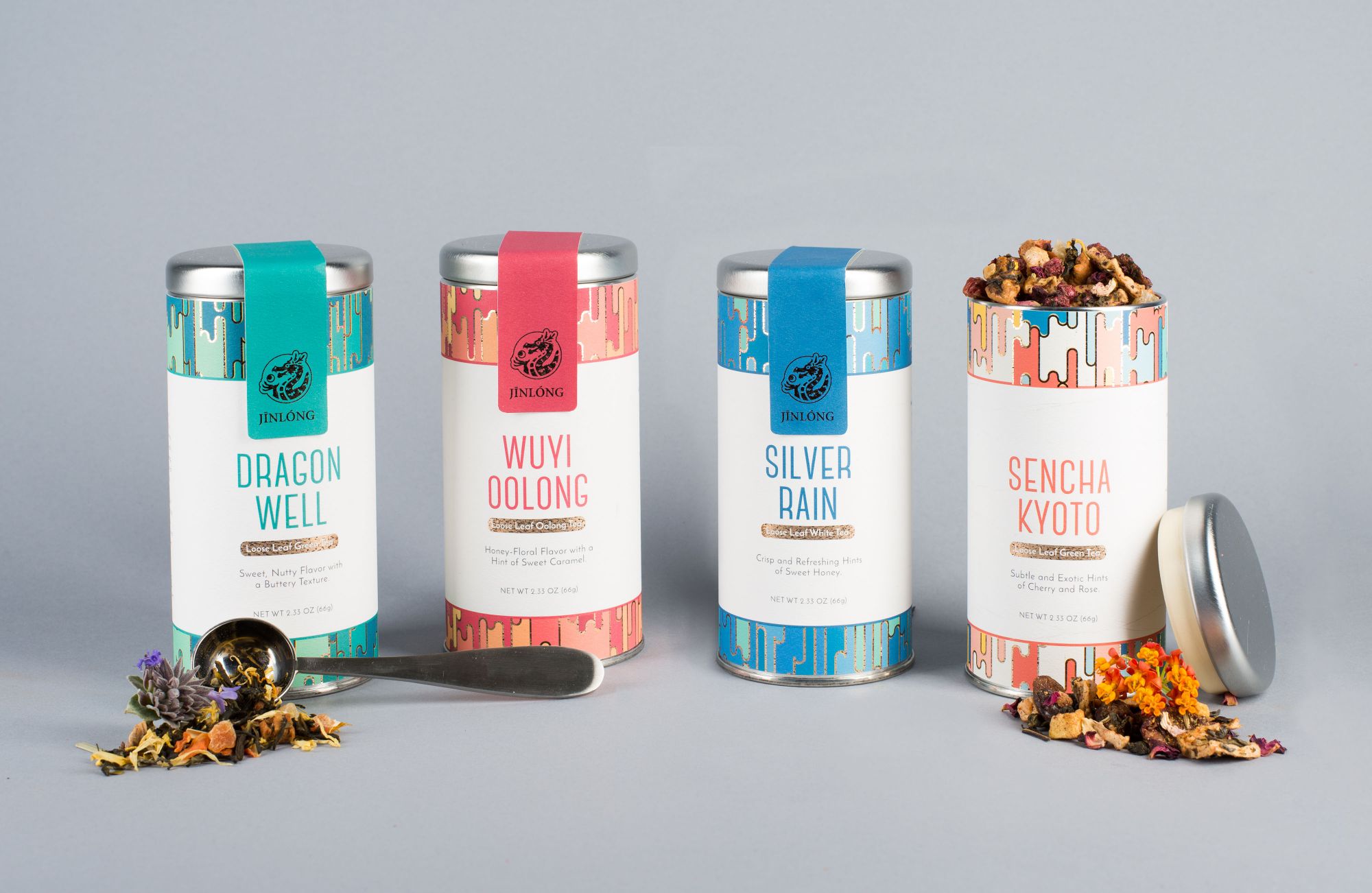
These beliefs and traditions inspired the elegance and richness of the packaging. I created the brand to have a contemporary look and feel while keeping cultural customs in mind. I incorporated this idea by using a mix of bright and traditional colors as a backdrop for the fluid pattern of intricate gold foiling. I chose to mix a traditional serif and modern sans serif to further illustrate the mixing of old world and new.
design in mind


branded
