Pet Sitting Mobile App
Sara Blaylock
Pet Digs
Mobile Illustration
Baloo & Open Sans
PetDigs is a pet sitting app where pet owners get free, in-home pet sitting in exchange for giving the pet sitter/traveler a place to stay; in exchange, the traveler looks after pets and plants. It is “the warm and fuzzy way to travel”. The beta app is currently available to connect travel enthusiasts and pet lovers in California’s San Francisco Bay Area.
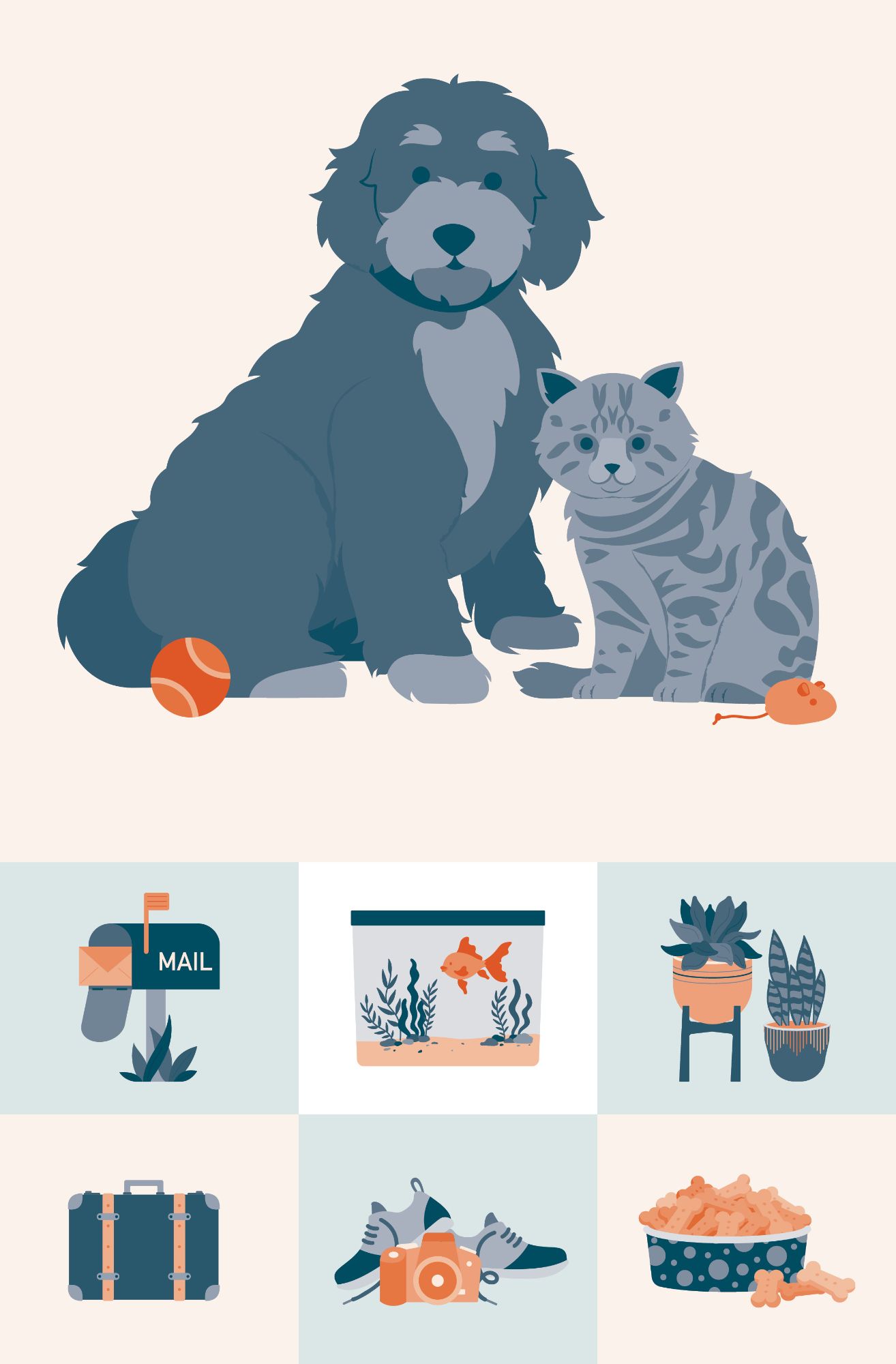
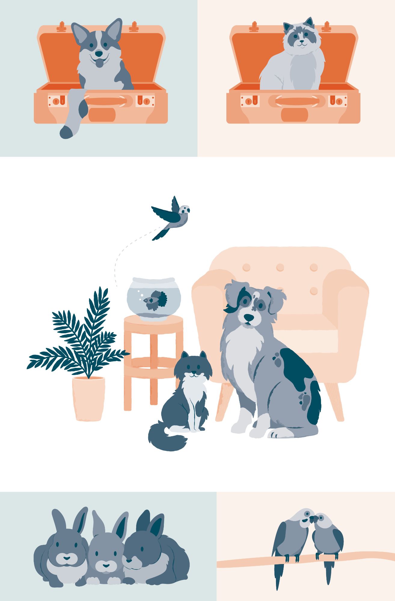
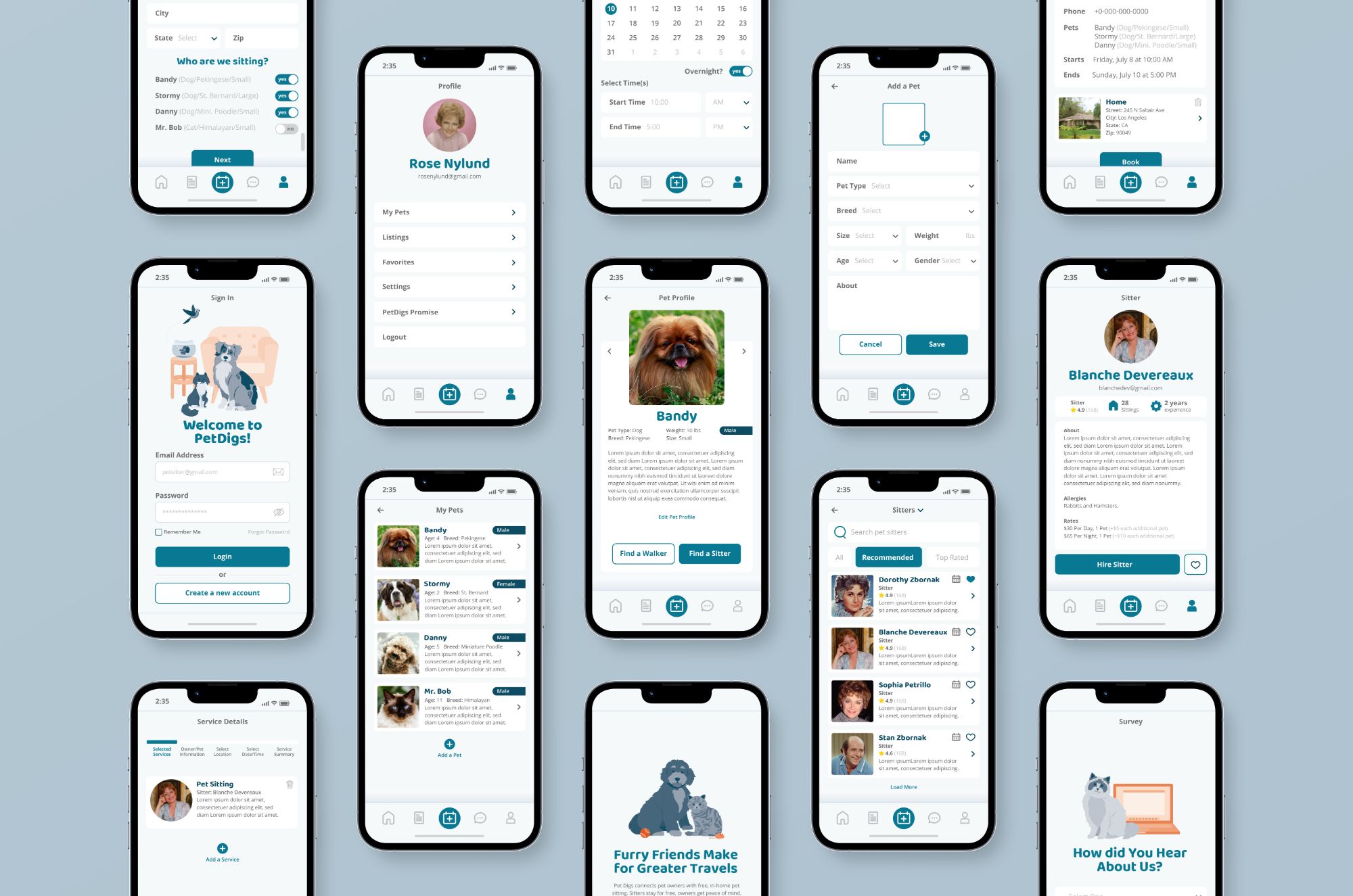
PetDigs needed professional illustrations that were cute and inviting. In addition to the illustrations, app screen layouts were needed to understand the different user experiences, as PetDigs can be utilized by both hosts and pet sitters. A clean, straightforward, and simple user interface (UI) were needed to achieve the successful application and optimal user experience (UX).
design in mind
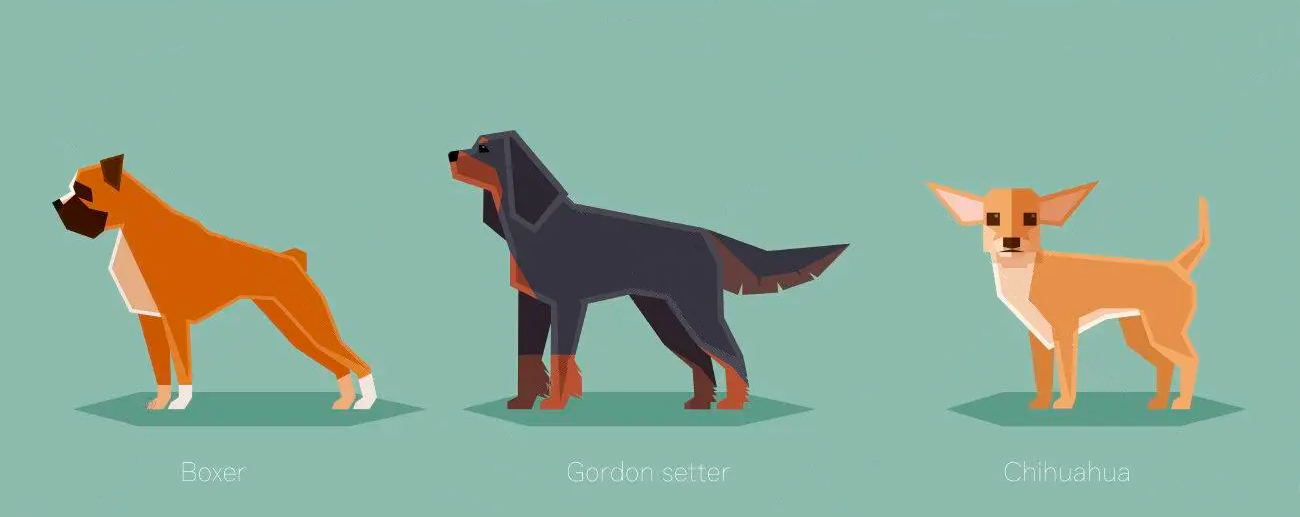
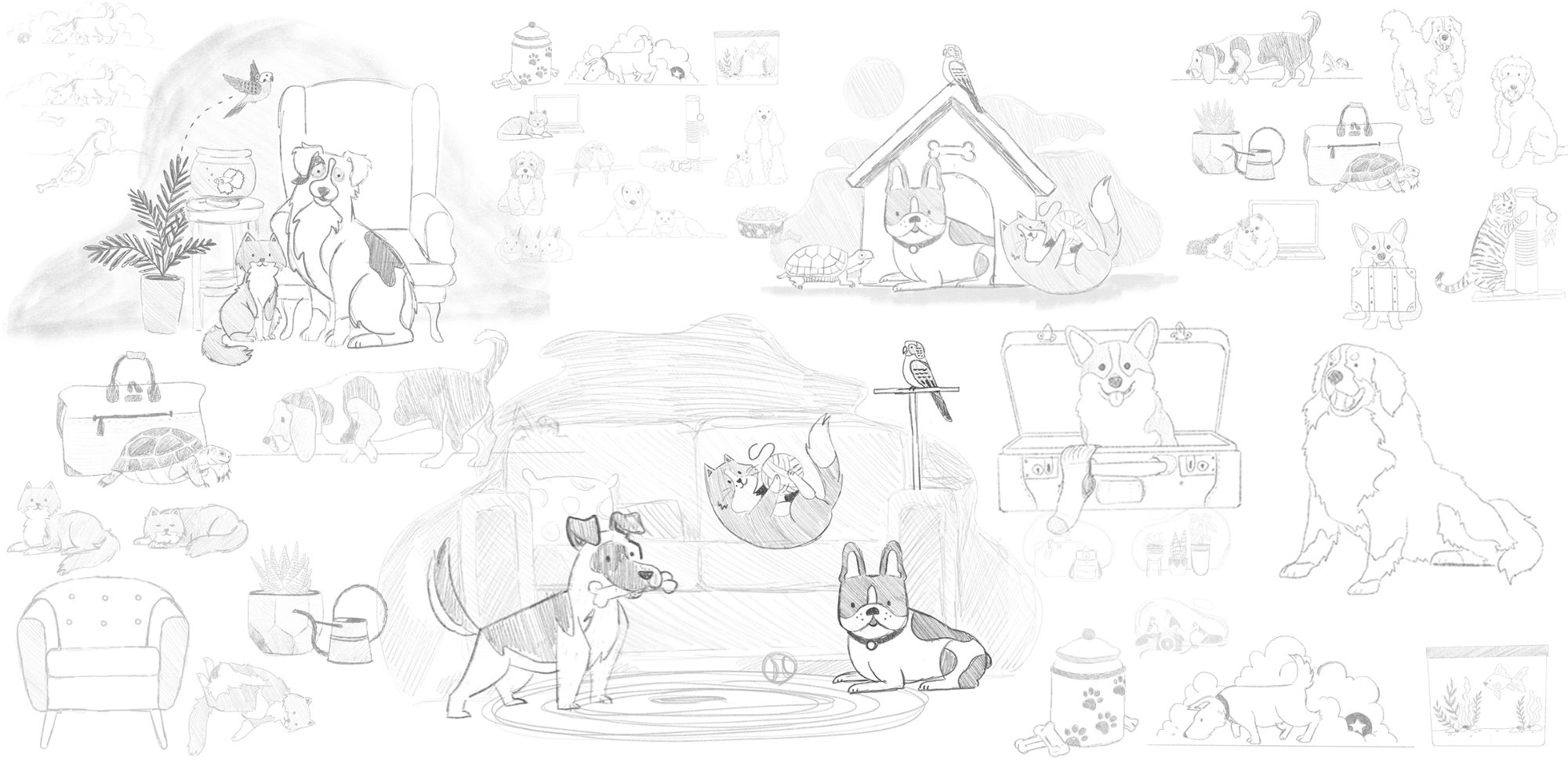
At the beginning of the project, there were a slew of ideas, style inspirations, and concepts explored. Most of the samples provided shared similar characteristics; very simple, line-less or clean line work, vector illustrations with minimal detail. Many of the sample images provided were very geometric, with harsh angles and rigid lines. Another style explored was more sketch inspired. Illustrations with linework that were more traditional and painterly in style with true to life colors. While this illustration style is great, it harshly contrasted the brand colors and just didn’t feel right for PetDigs.
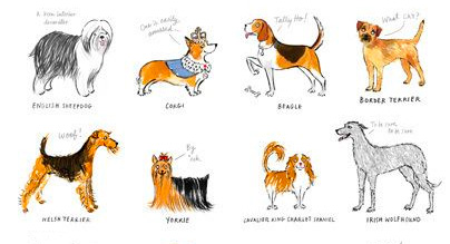
Ultimately, the app needed to feel both professional and inviting. The illustrated animals needed to be easily recognizable and cute, without looking childish. The vector illustration style with soft, round edges, rather than rigid geometric, was the style that accomplished this goal the best. When it came to colors, a monochromatic color scheme consisting of tints and shades of the brand colors was the best option so as to enhance the brand, rather than compete with
the design.
final vector